Would you like to know how to use a minimalist color palette to elevate your room?
You will learn that neutral color tones will elevate your space no matter your design style.
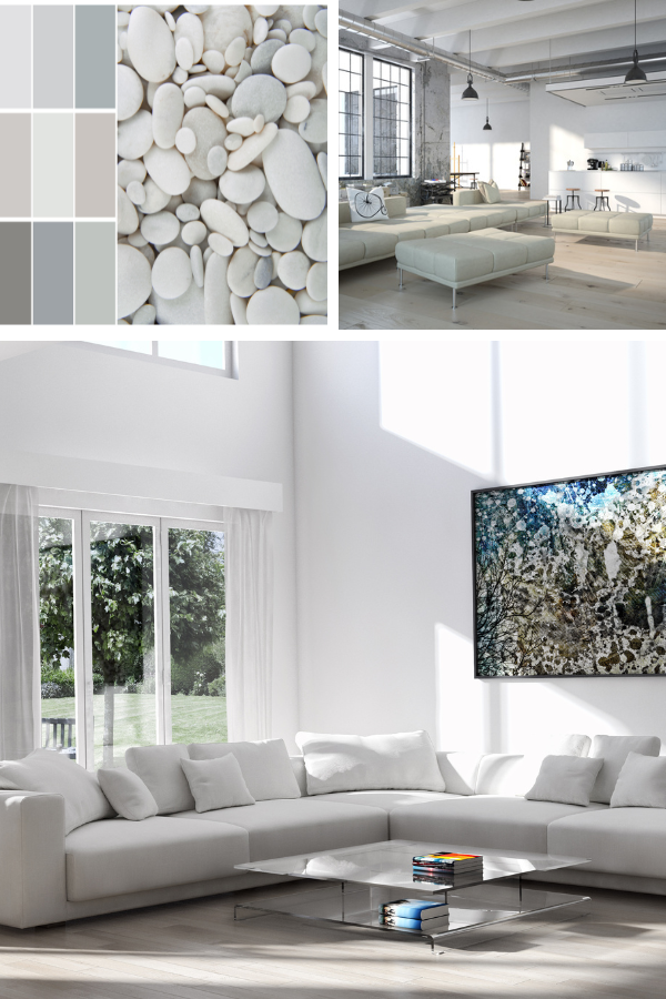
Speaking of neutral color palettes, I am helping my daughter to achieve an eclectic design style, starting with a neutral color palette. I can’t wait to share the outcome.

A minimalist color palette consists of a restrained selection of colors, often neutral tones like white, beige, grey, and black.
Discover the versatility of a minimalist color palette, serving as the foundation for a myriad of design styles, from modern minimalism to monochromatic elegance to the clean lines of Scandinavian simplicity.
Whatever your style is, you will learn that starting a minimalist color palette is the beginning of transforming your space.
The Art of Simplicity: Harnessing the Beauty of a Minimalist Color Scheme
Black and White Color Scheme

Perhaps the most classic minimalist palette, black and white, offers timeless elegance with its high-contrast combination. Although clean, sophisticated, and versatile, it is suitable for various design applications.
Monochromatic Color Scheme

A monochromatic color palette based on neutral tones such as beige, taupe, and gray creates a serene and understated look. These colors evoke calm and sophistication, making them ideal for minimalist, Scandinavian, and African Boho interior design styles.
See Related Post: 11 Monochromatic Living Room Ideas
Soft Pastels Color Palette

A minimalist color palette of soft pastel hues like pale pink, light blue, and mint green can create a delicate and soothing minimalist palette.
These colors add subtle warmth and whimsy while maintaining a clean, airy aesthetic.
Earthy Color Palette

Earthy colors inspired by nature, such as warm browns, soft greens, and muted terracottas, can form a minimalist color scheme with a grounded and organic feel.
These tones create a sense of connection to the natural world and are often a basis for many interior designs, from Boho to Eclectic design styles.
High Contrast Colors

Adding a pop of high contrast color in a predominantly neutral palette can create visual interest and focal points. In contrast, this could be a bold accent color like a soft blue in kitchen cabinets or a vibrant red as an accent wall.
Consider also high contrast accent accessories, like accent pillows or pops of color sparingly throughout the space.
Explore using high contrast colors in your space, allowing you to develop many decorating ideas.
Grayscale color scheme

A grayscale palette with a subtle hint of color can add depth and dimension to minimalist designs. For example, pairing shades of gray with a soft blush pink or muted teal can create a sophisticated and contemporary look without overwhelming the senses.
Leave a Reply